*This section is usually reviewed and completed by: UX/UI and/or Branding
The Design System unifies user interfaces (UI) and user experience (UX) of our products, scales improvements in quality, reduces design and development times and serves as single source of truth for design best practices.
It is easy to customize the Design System Tokens to fit your brand with Color, Typography, and Components.
For the design phase, PROS will propose a design based on your core site and a codeless implementation to get the fastest product delivery. These are screens that showcase all available tokens personalized to your brand. Together with your design team, you will review and approve the design.
If you are going through a redesign in the next 4-5 months and would like to submit design guidelines, please fill out our design survey.
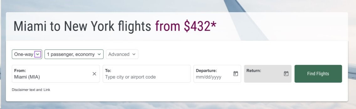
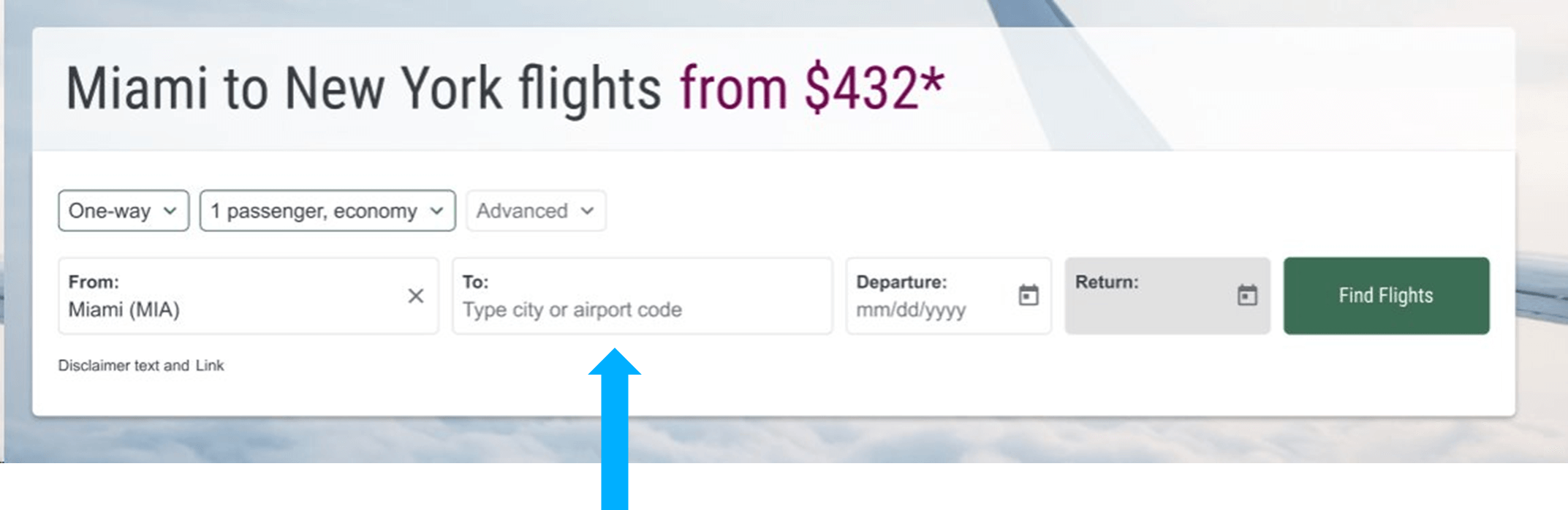
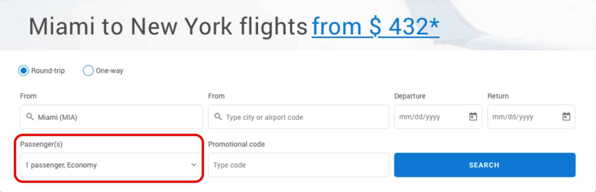
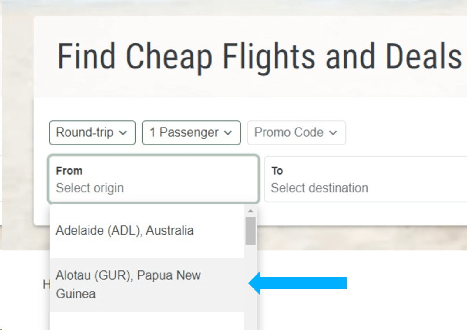
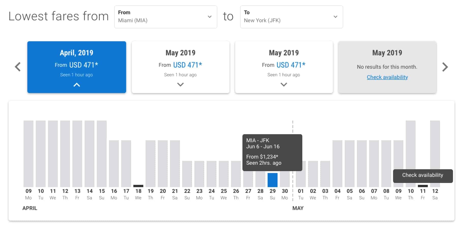
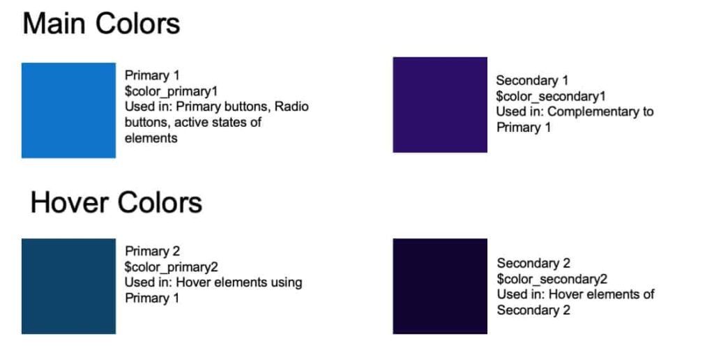
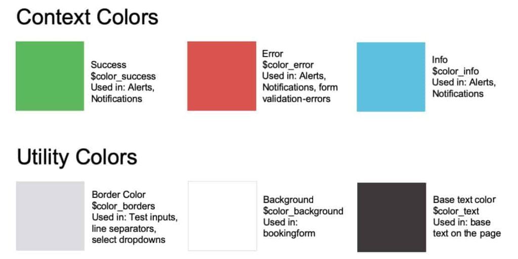
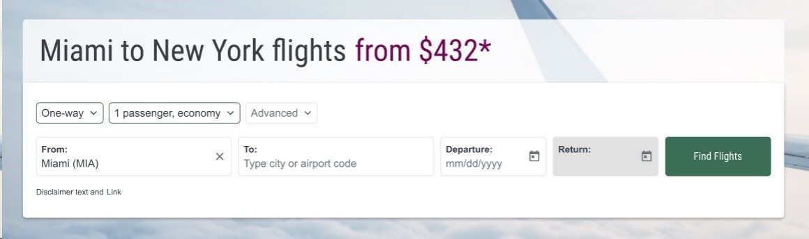
Below is an example of a set of color tokens and a real life example of how they come together in a Flight Search Panel airModule. See if you can determine where each of the Color Tokens will be used.
– Main Colors mark key information and transform to Hover Colors when the cursor touches them.
– Context Colors share information with the user.
– Utility Colors make up the background, borders, and text.
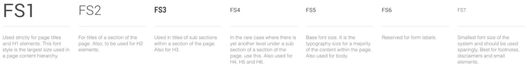
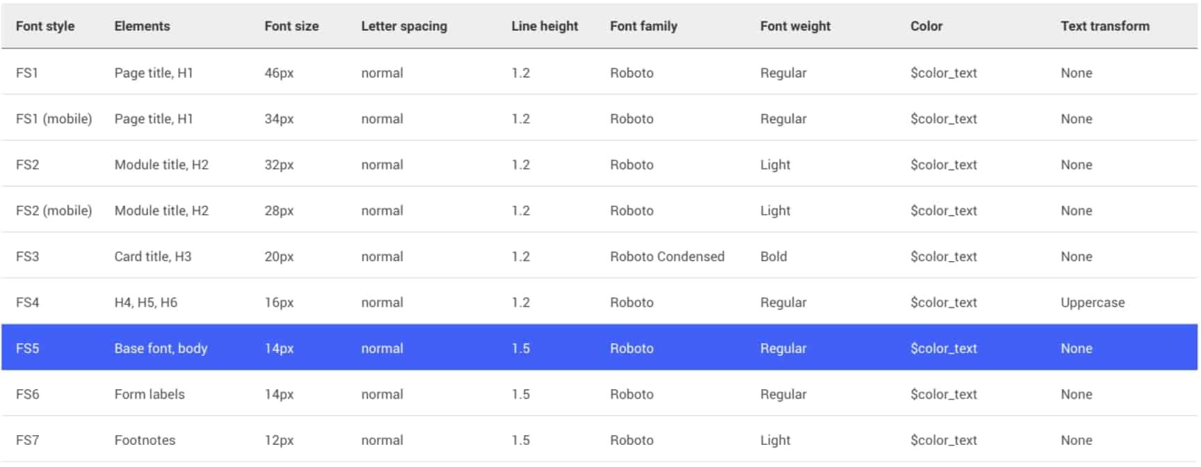
Typography / Fonts
Styles & variations
You will select:
Font styles 1-7
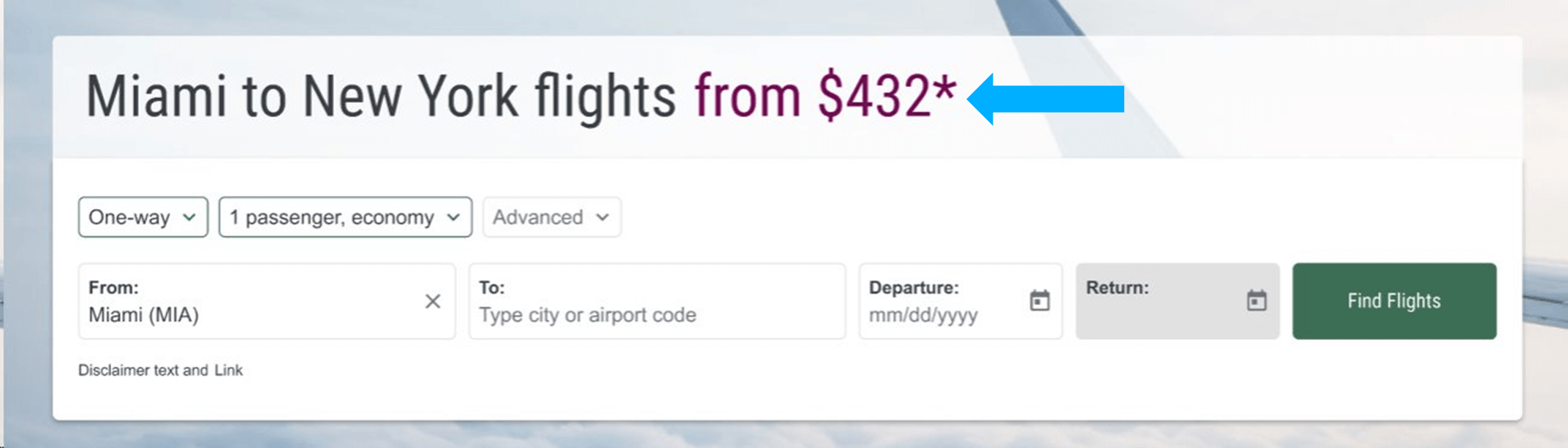
This includes details like the Page Title, airModule Title, Fare Card Title, and more.
Variants color
Determine the color of the text on the page and within Fare airModules
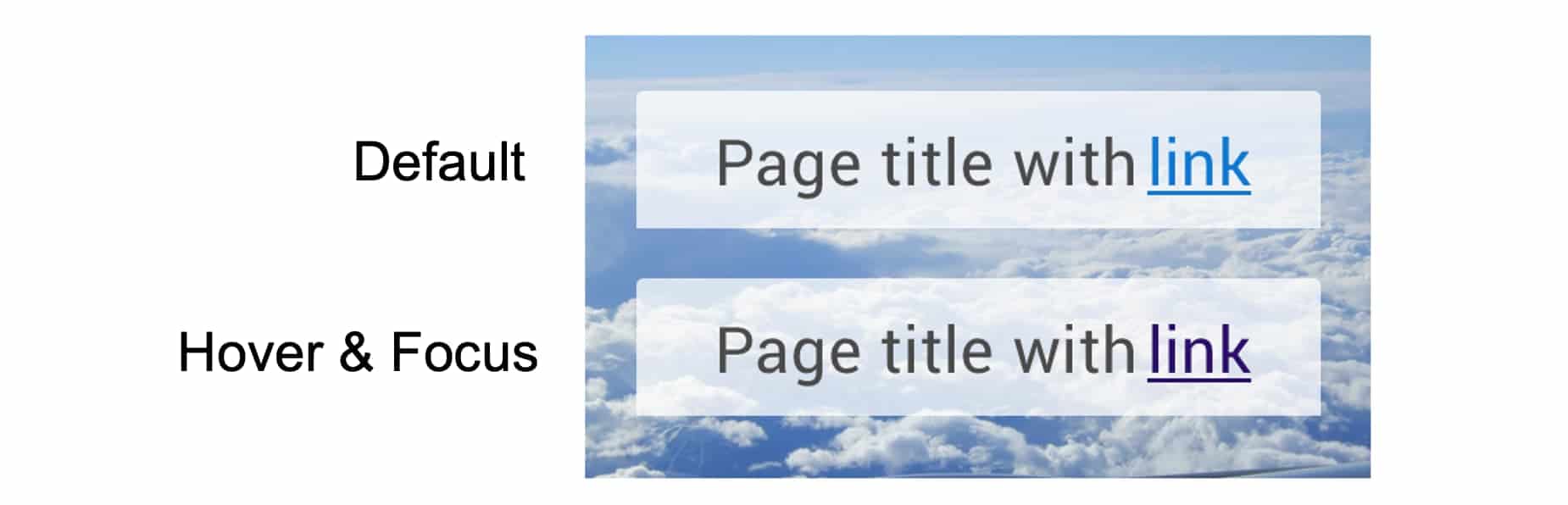
Link decoration
Including images and descriptions
Components
Components consist of:
1. Buttons: Buttons are used along the flight booking process and give end users the option to see additional results or guide the user through non-booking processes.
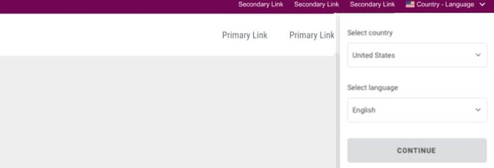
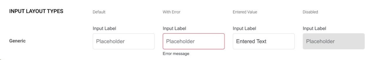
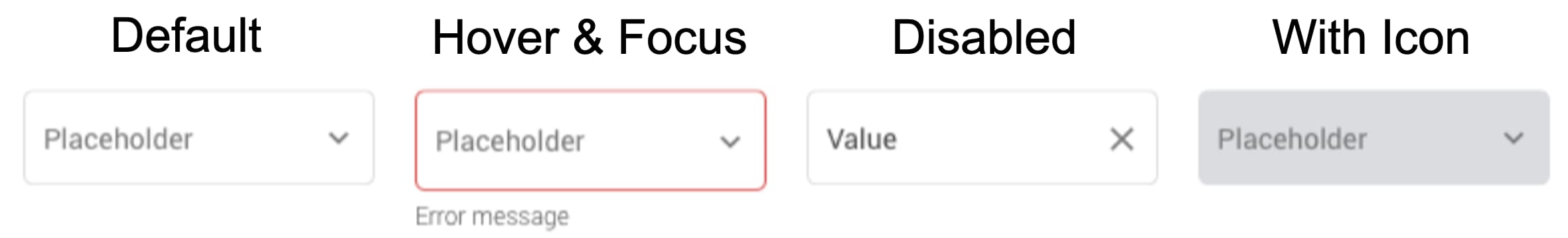
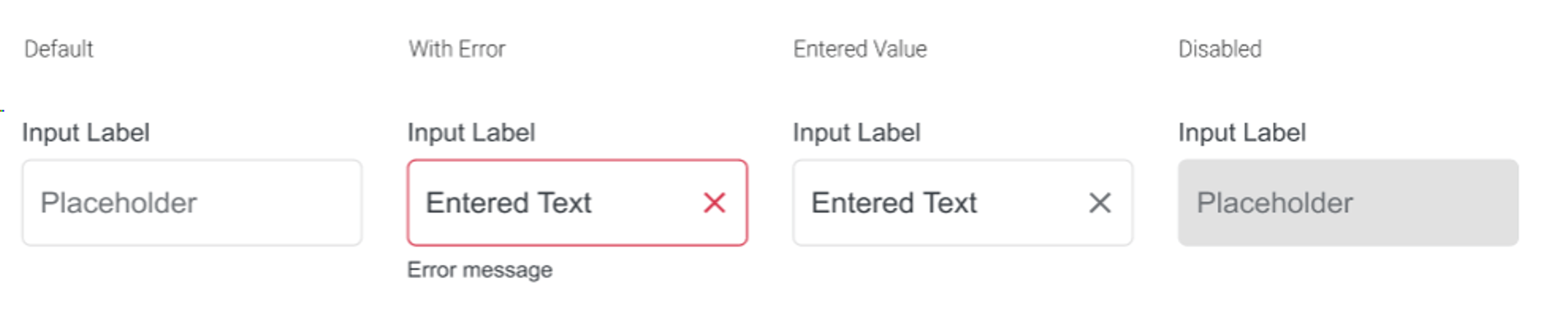
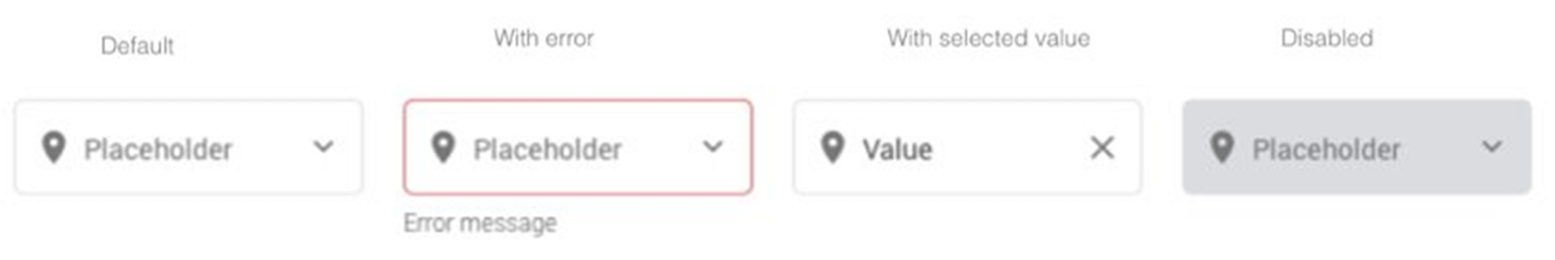
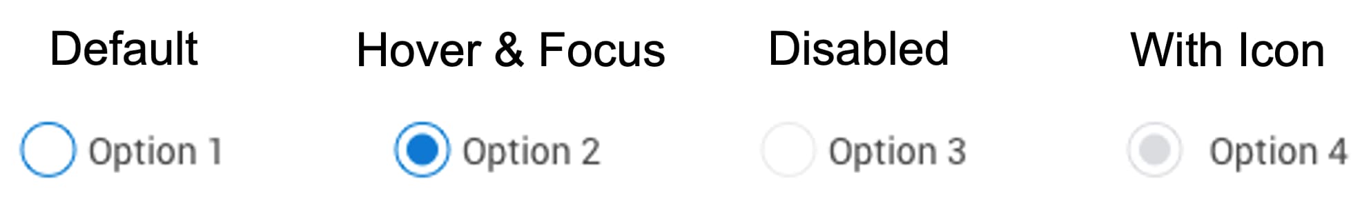
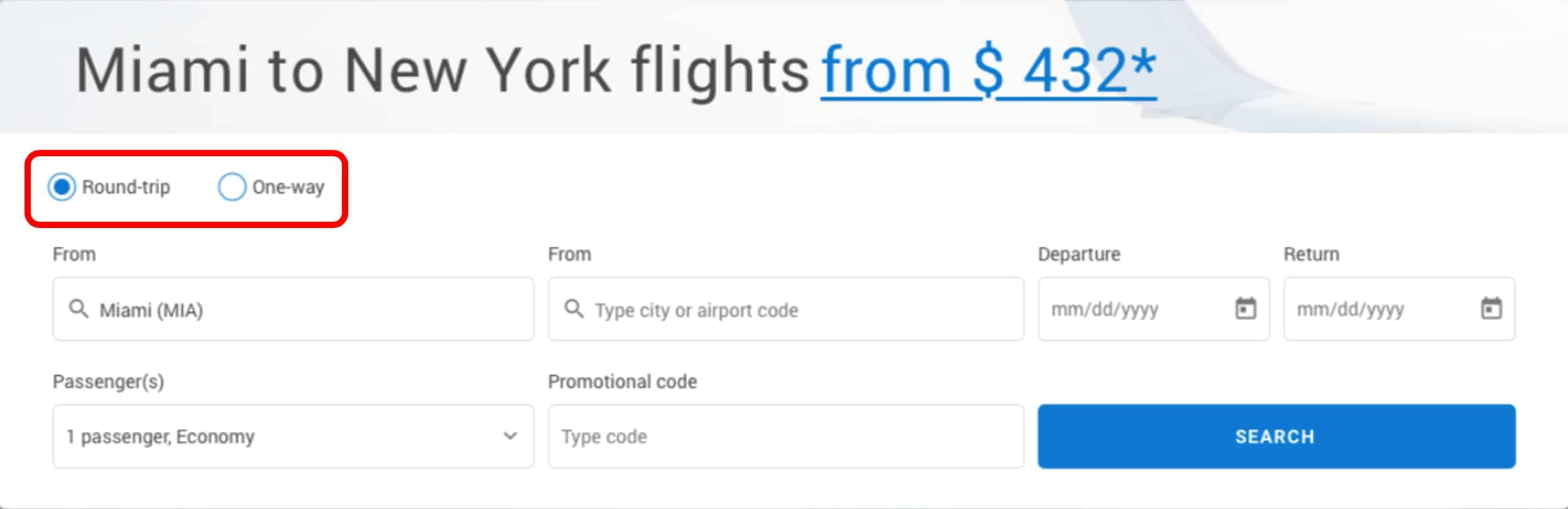
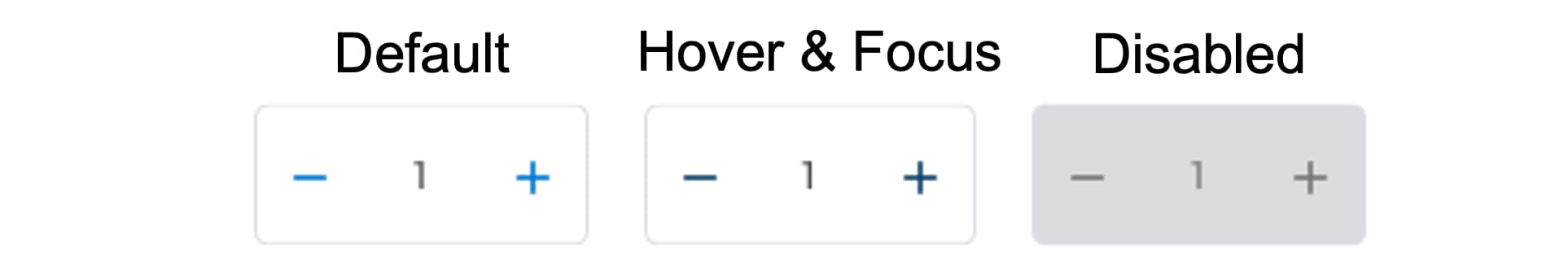
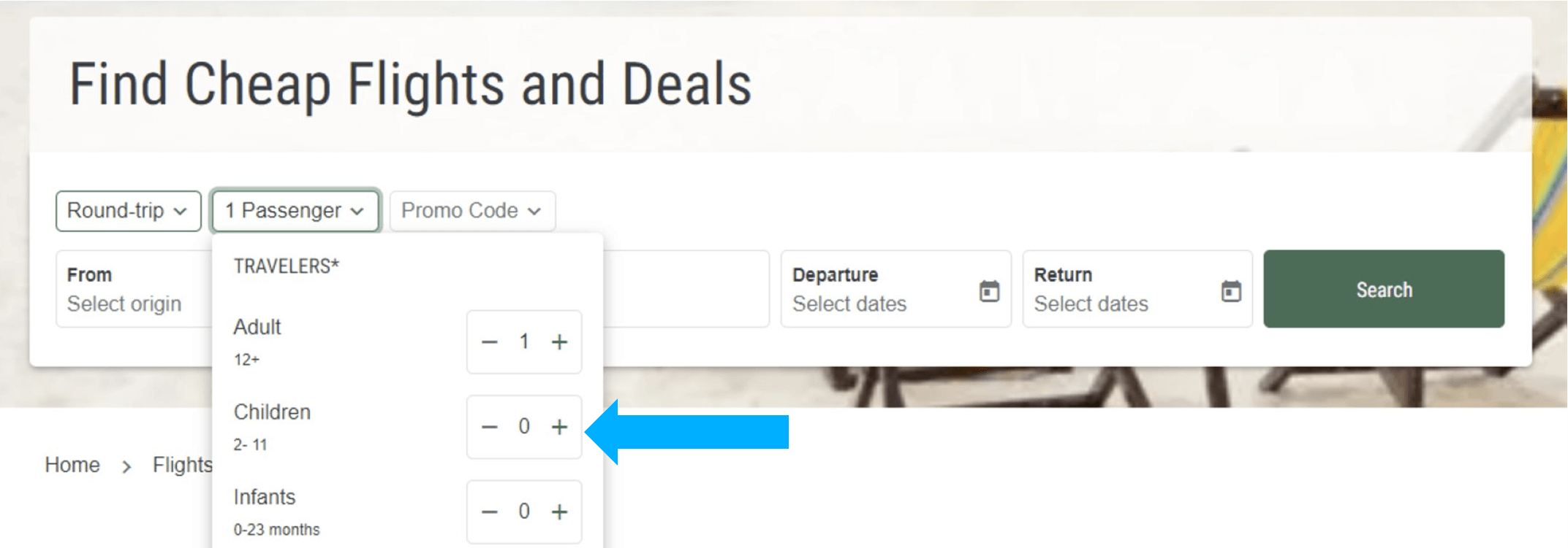
2. Forms: End users input or select options from Forms. These include text inputs where the end user can type in their selection, or select an option from multiple choices.
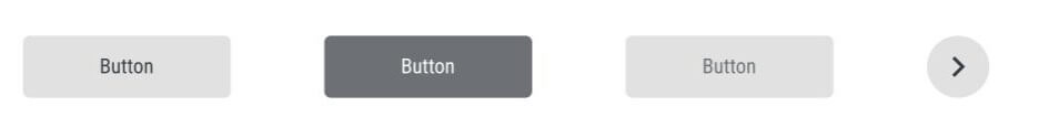
1. Buttons
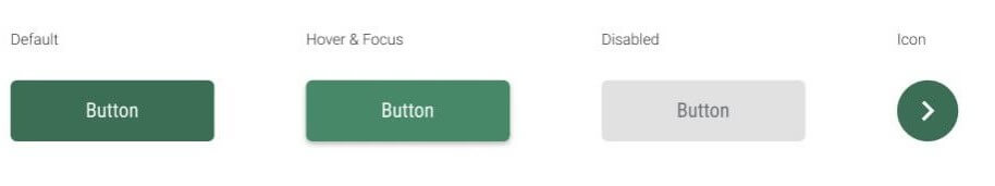
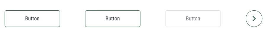
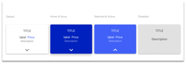
The Design System includes three types of buttons: Primary, Secondary and Tertiary.
For micro-conversions, like loading more results. Secondary Buttons are found in airModules with scrolling functionality or when giving users the option to see additional results.Example:
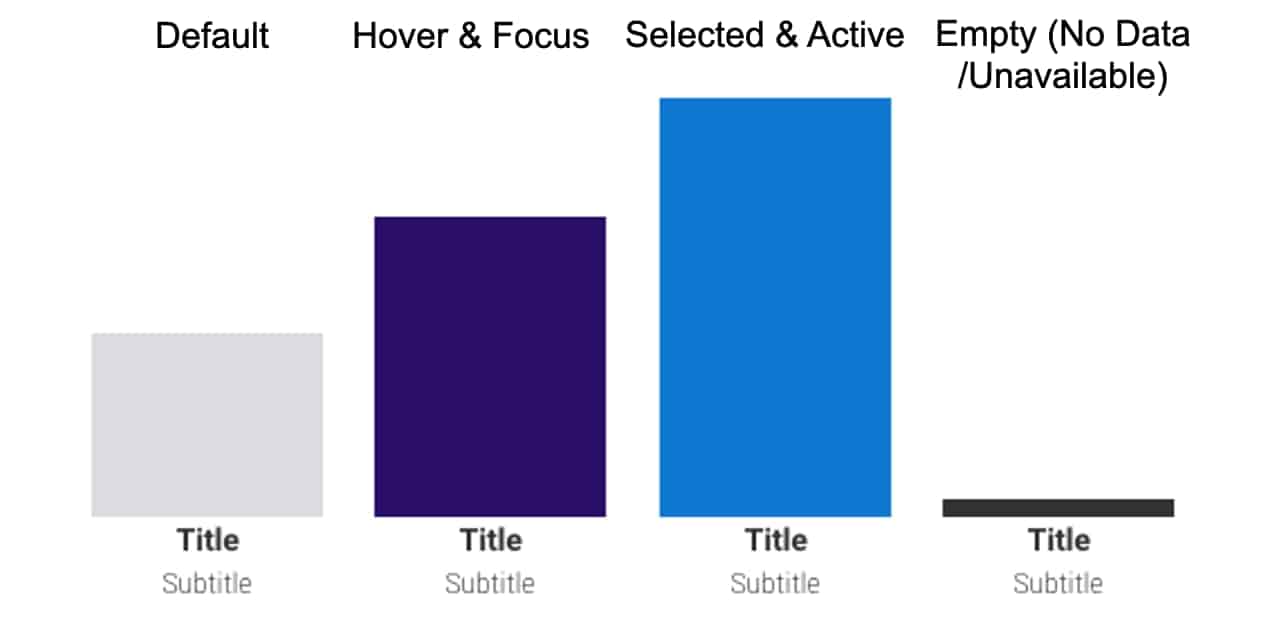
This form is used in filters to prompt users to select a text input from a menu of options. For example, the number of passengers, fare class, or departure and arrival airports.Example:
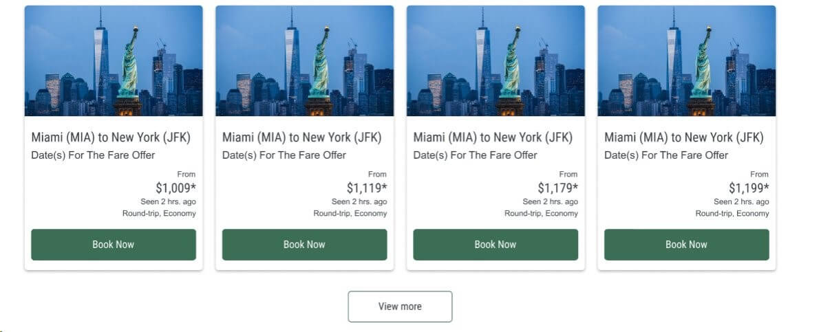
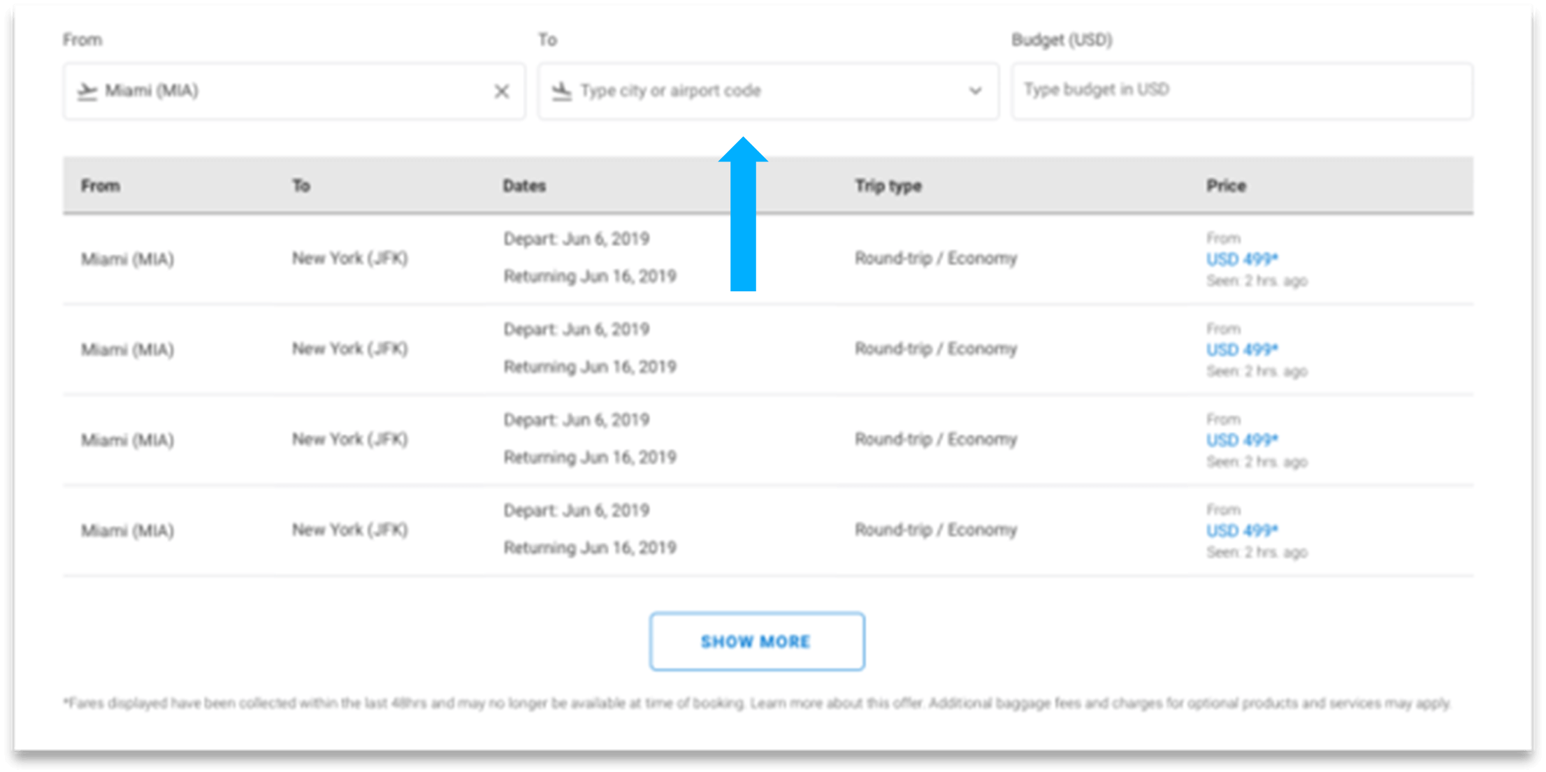
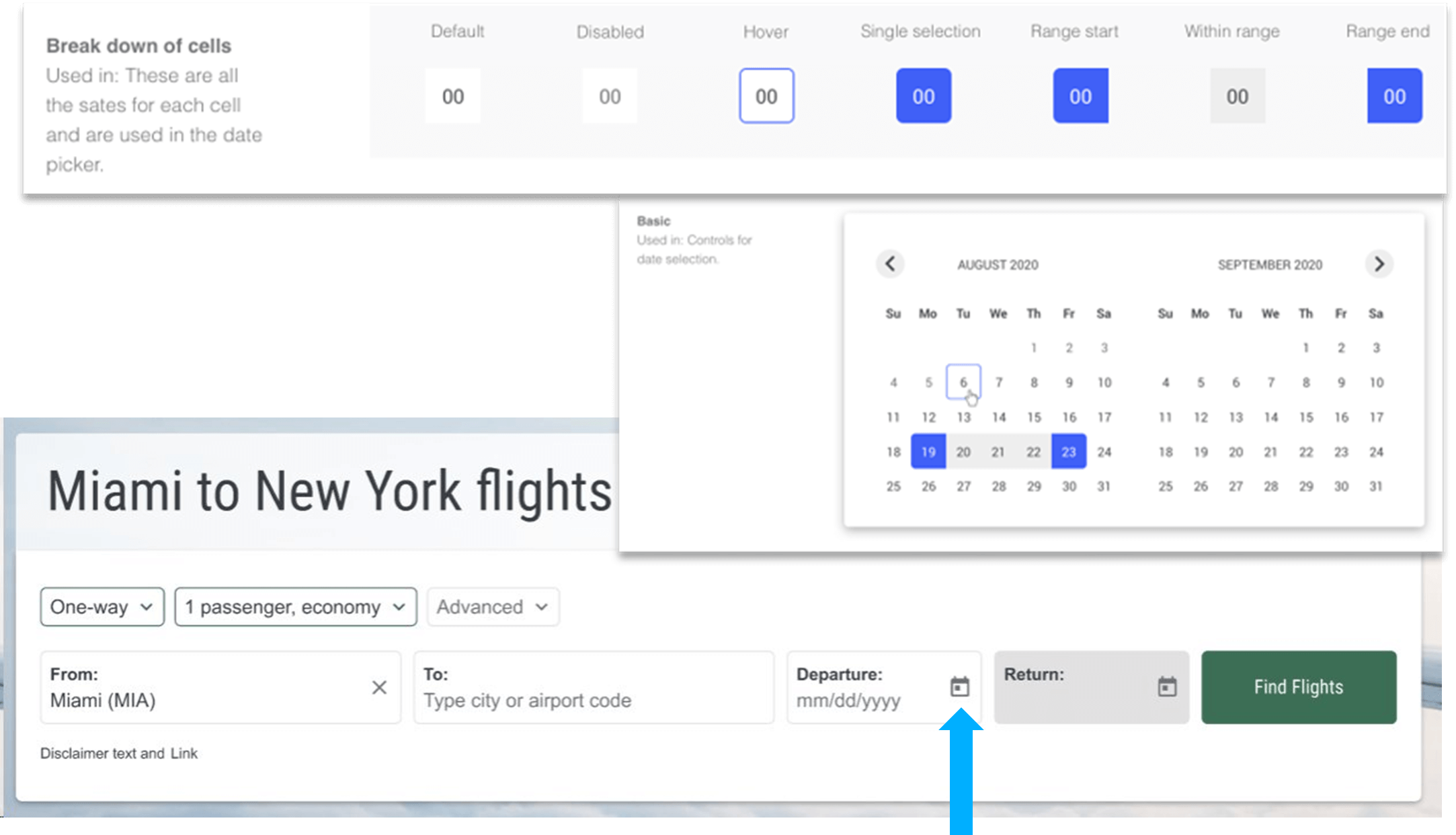
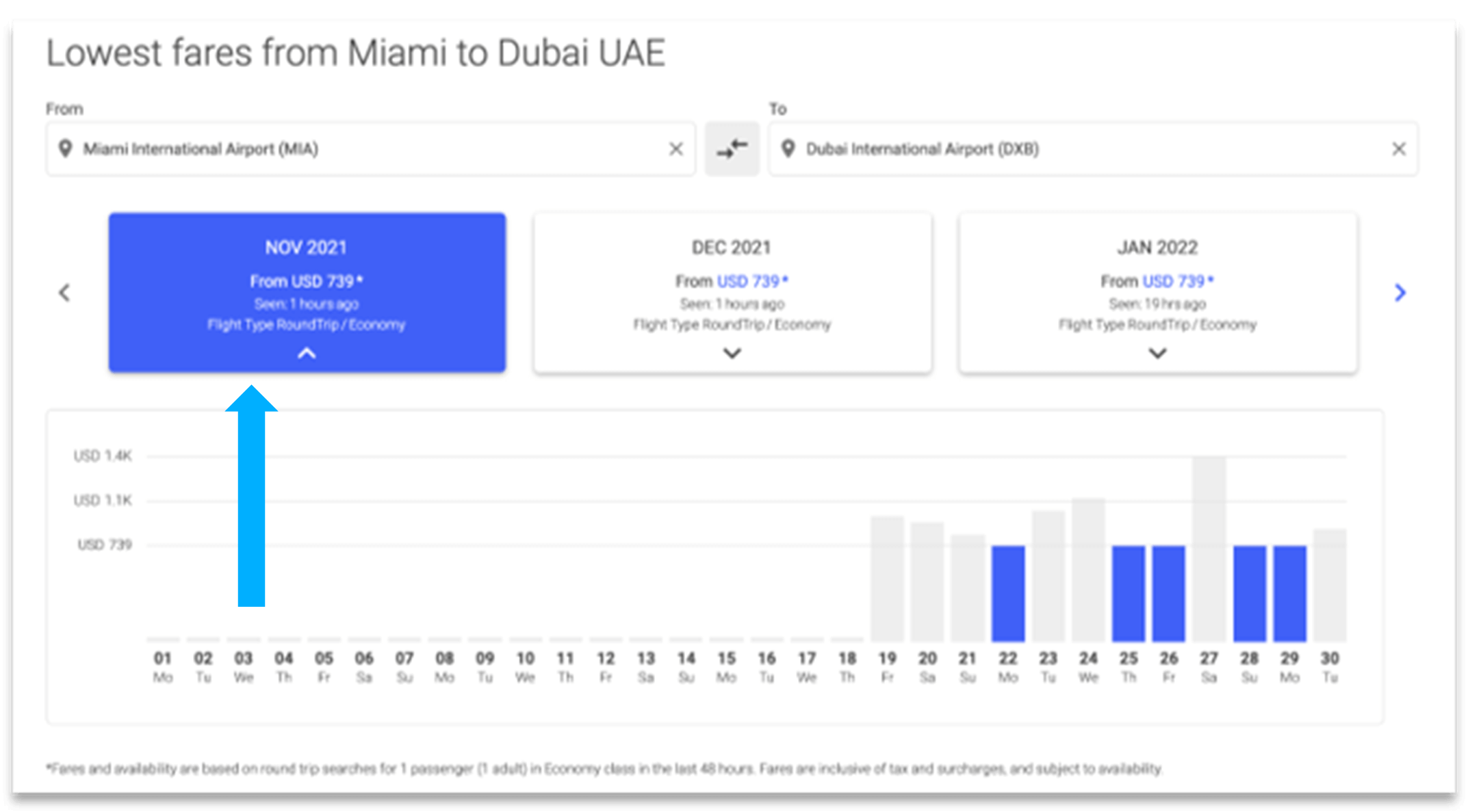
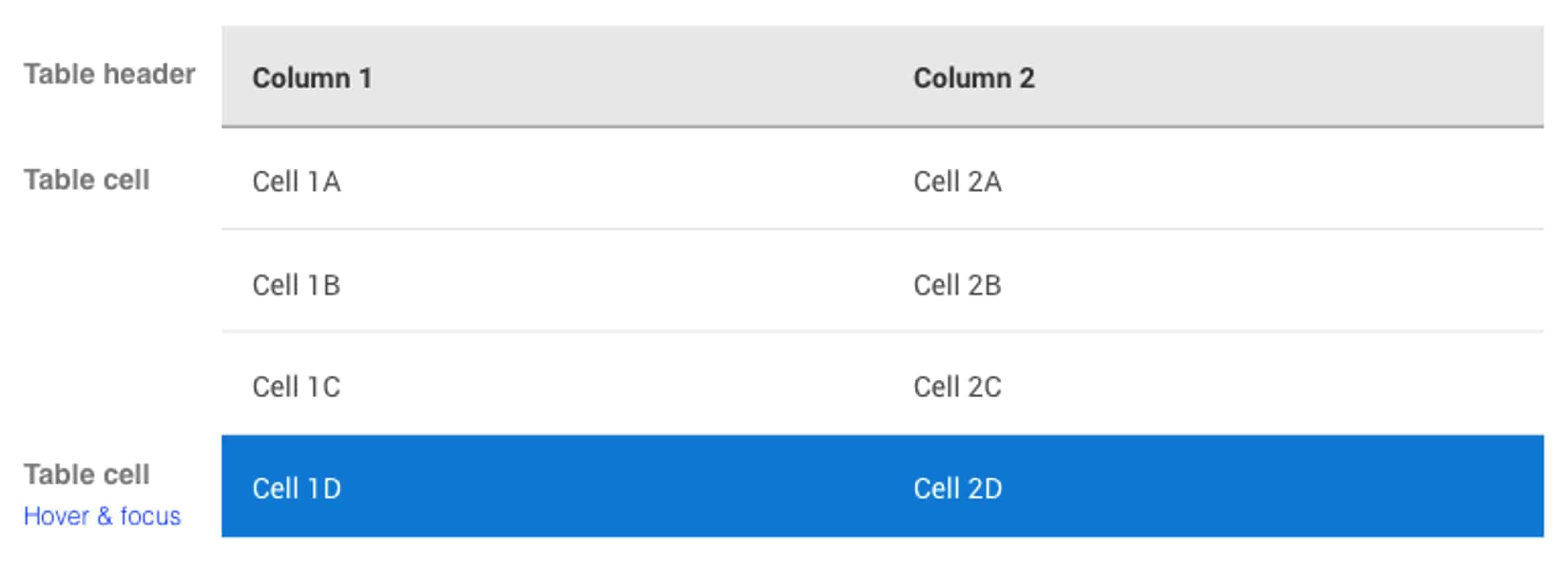
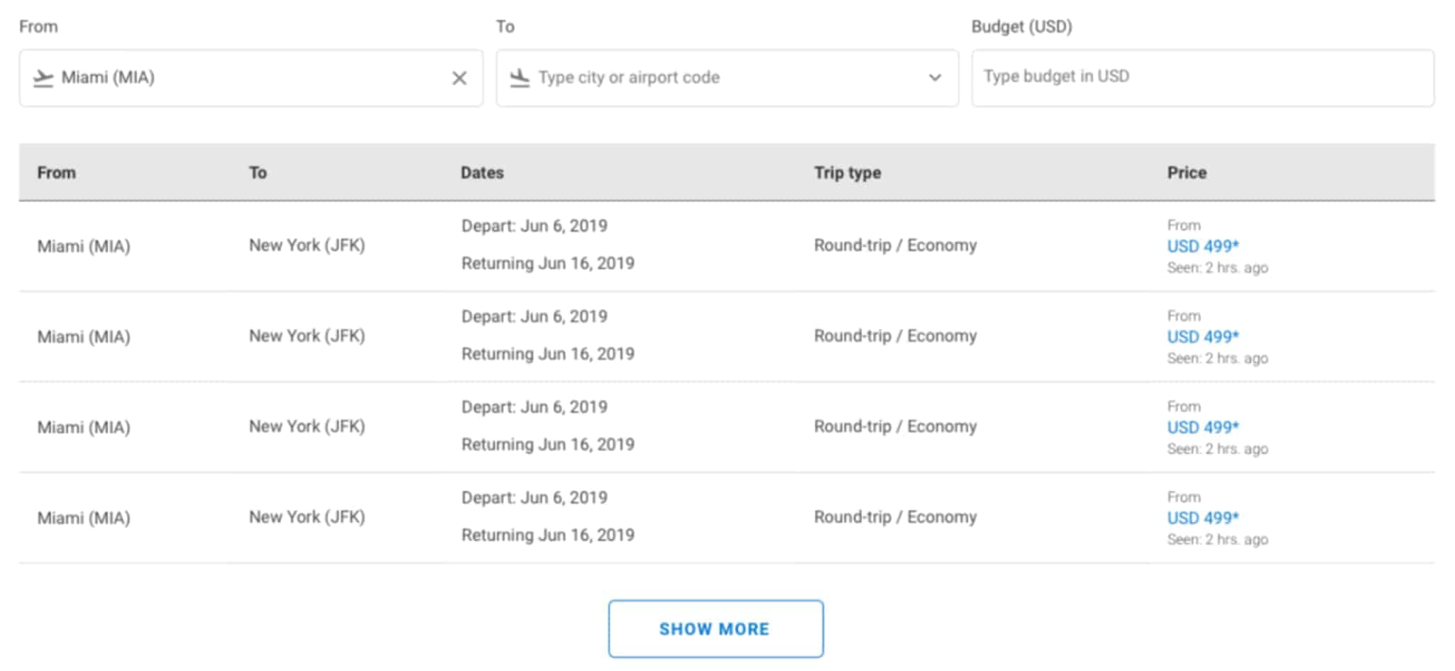
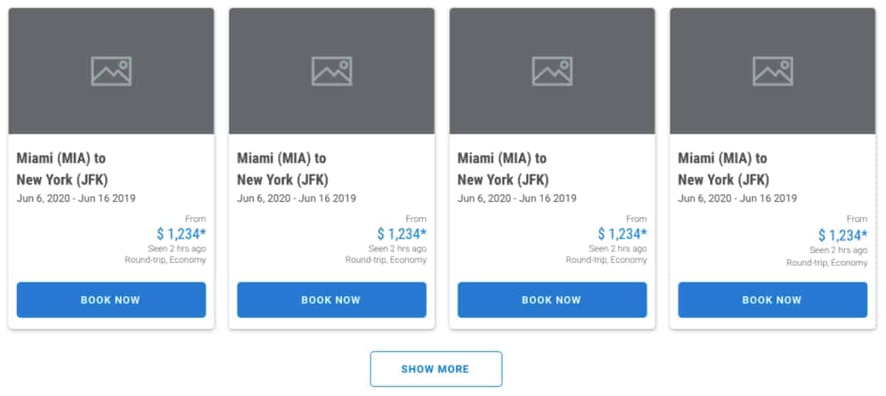
The table is used to display a list of options along with any features tied to each option, like dates, travel class, and price. The Table airModule is one of the most popular airModules.Example:
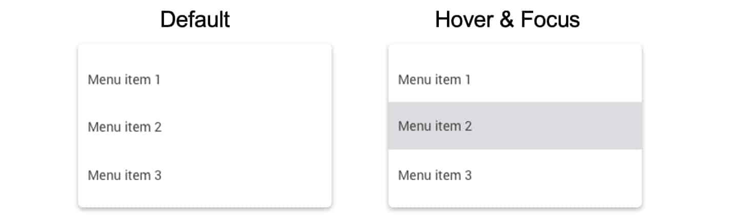
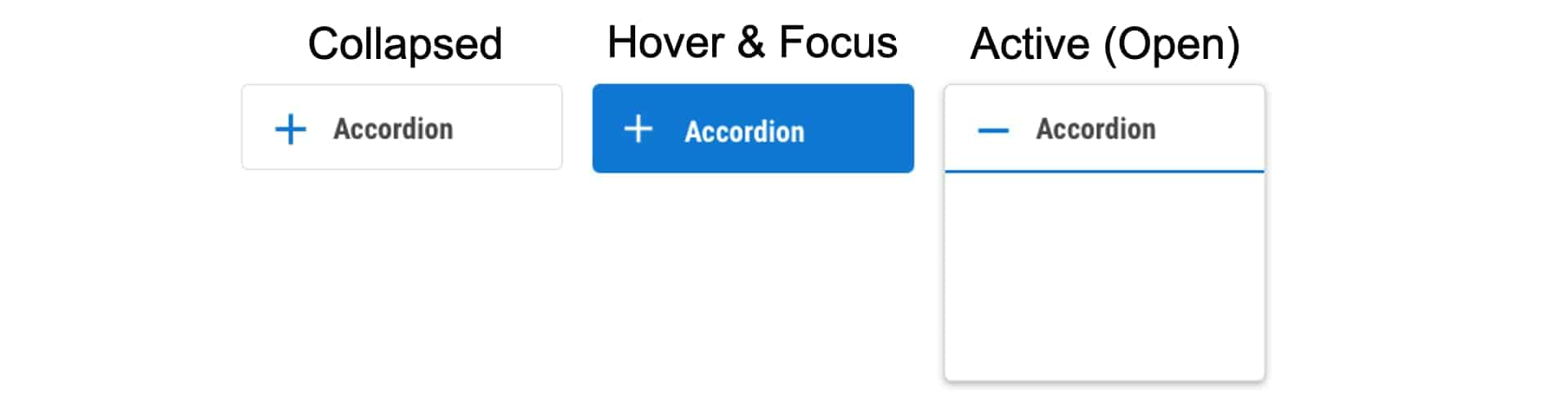
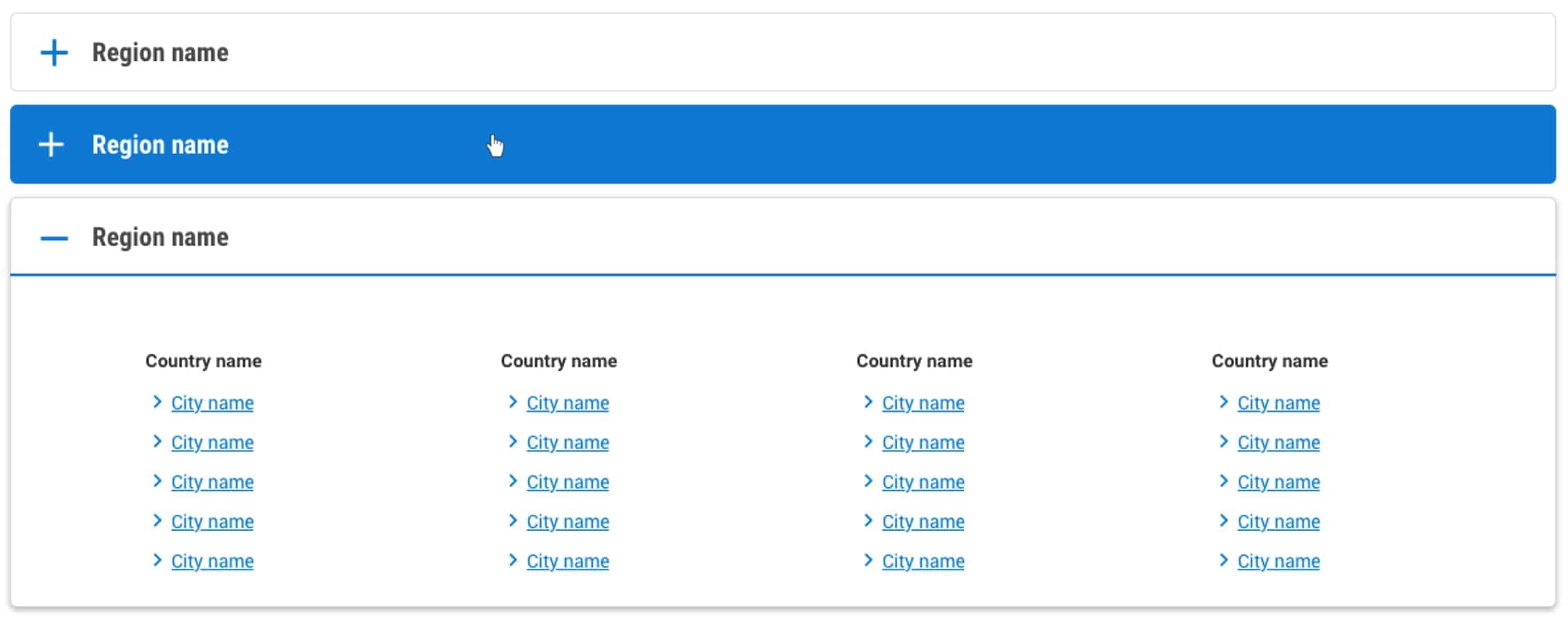
The accordion form is used to share large amounts of options in a compressed way. The Destinations Accordion enables airlines to share links to every destination in their route network, organized by country or region.Example: