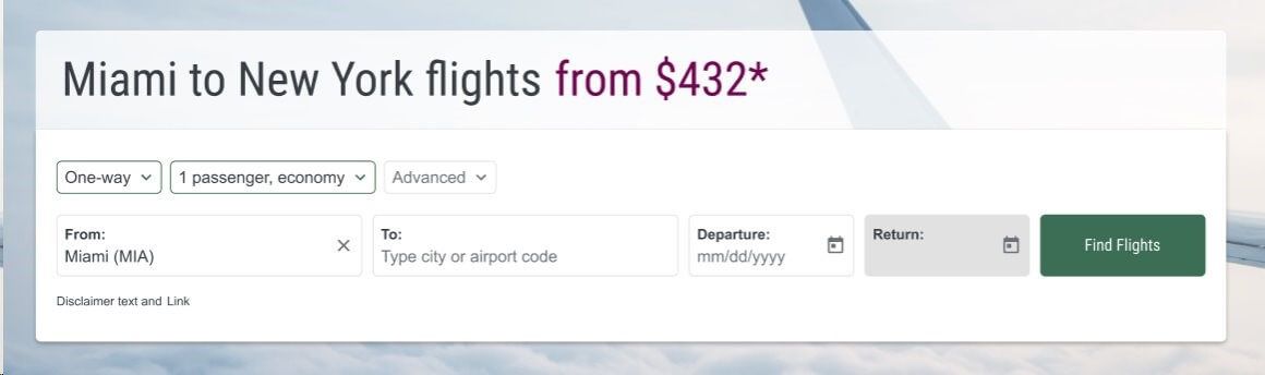

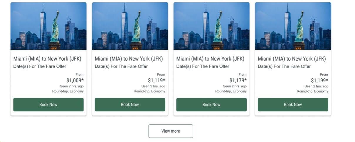
For Macro-conversions, like flight search. Primary Buttons are used along the flight booking process.

Example:
For micro-conversions, like loading more results. Secondary Buttons are found in airModules with scrolling functionality or when giving users the option to see additional results.

Example:
For navigation to non-branded forms. Tertiary Buttons are used to guide the user through non-booking processes.

Example:

This form is used to collect freeform user input within filters. It allows users to manually enter information.

Example:

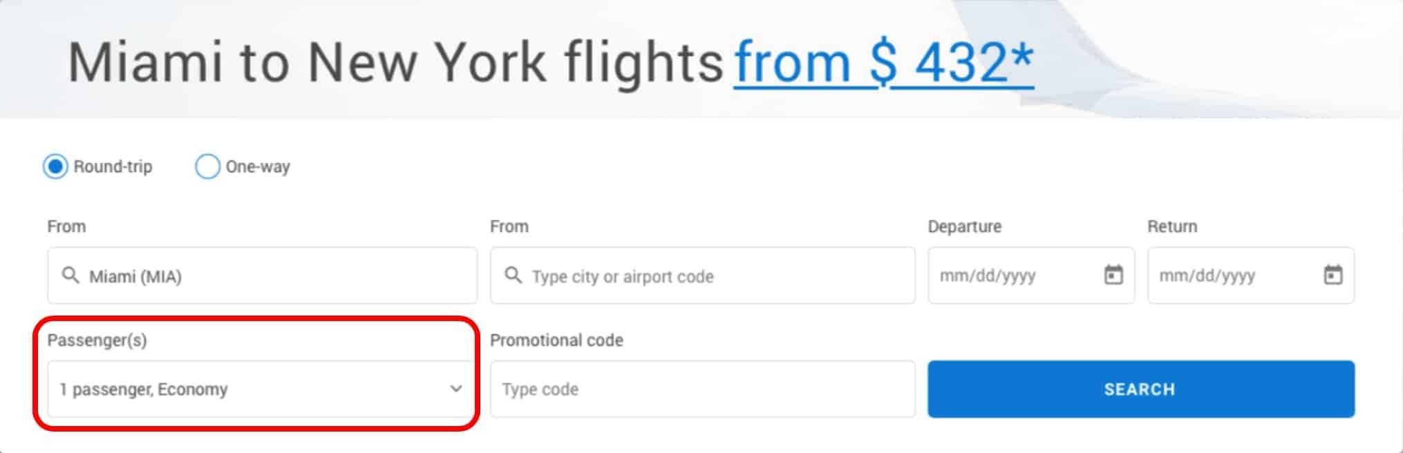
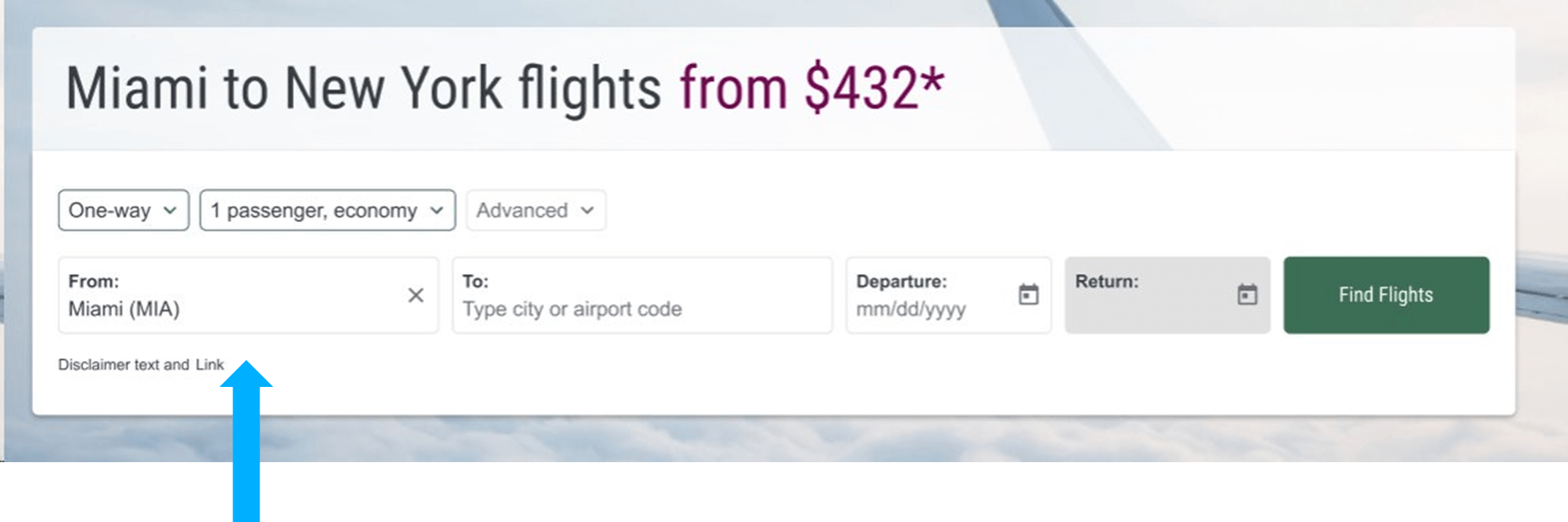
This form is used in filters to prompt users to select a text input from a menu of options. For example, the number of passengers, fare class, or departure and arrival airports.

Example:
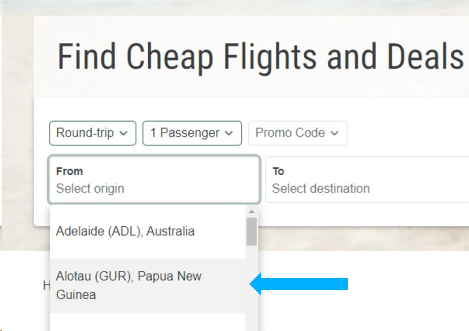
This form is used to capture text input from a menu of options. For example, the departure airport city name or code.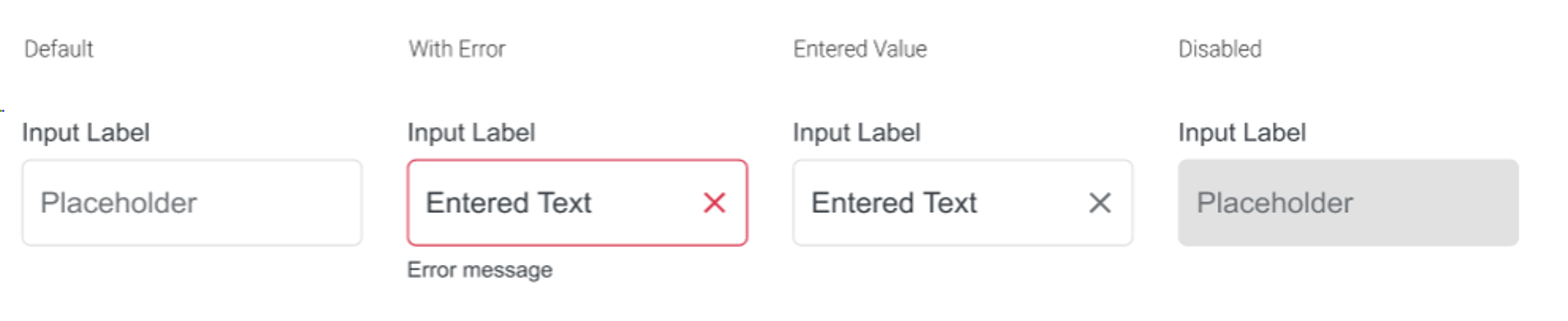
Example:
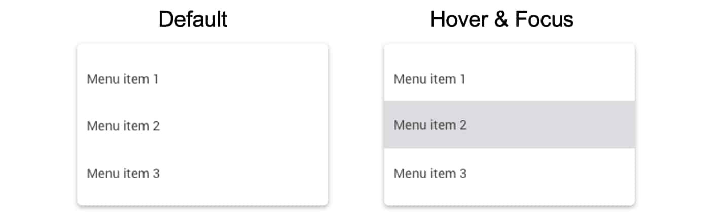
This form appears in dropdown menus. For example, the dropdown menus found in some airModule filters.
Example:
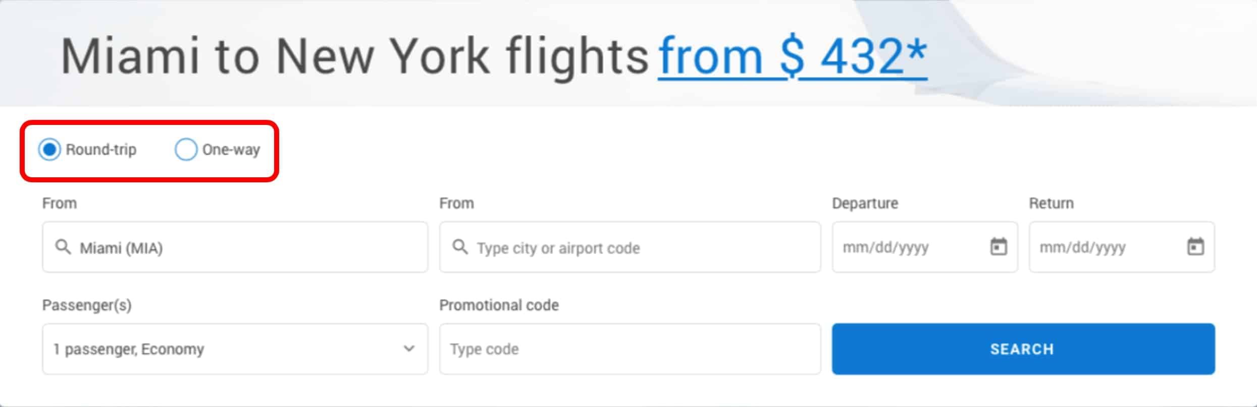
This form is used to check on or off certain options, such as Round Trip or One Way options on an airModule filter.
Example:
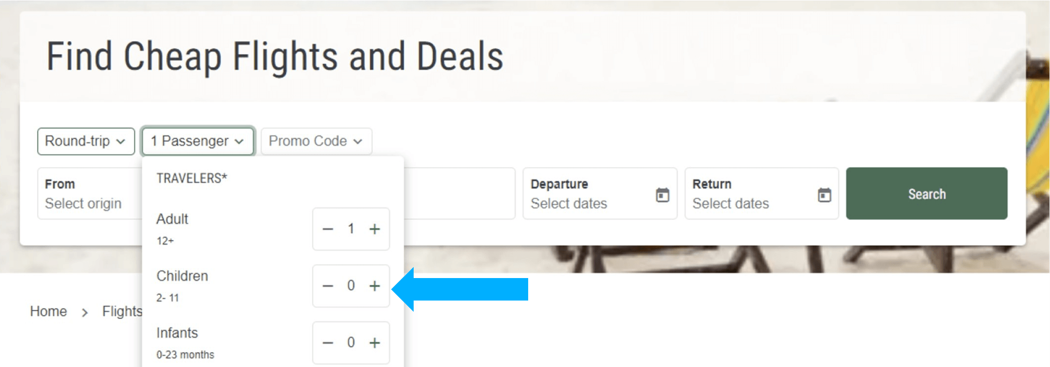
This form is used to select the a number input, such as the number of passengers.
Example:
This calendar form is used to select the departure and return dates.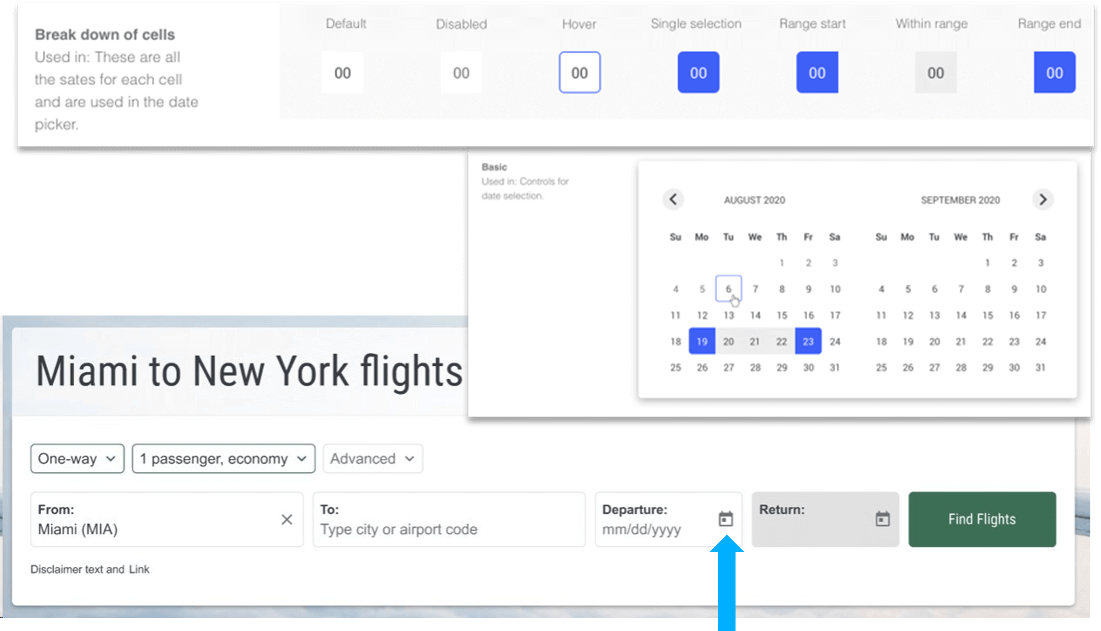
This form is used to toggle more information about each option. It can be found in airModules to navigate to each month.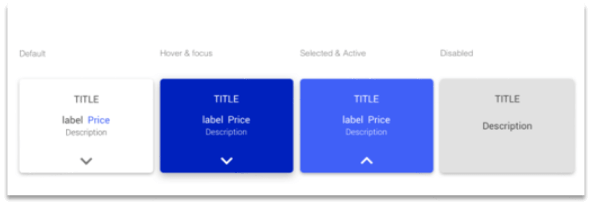
Example: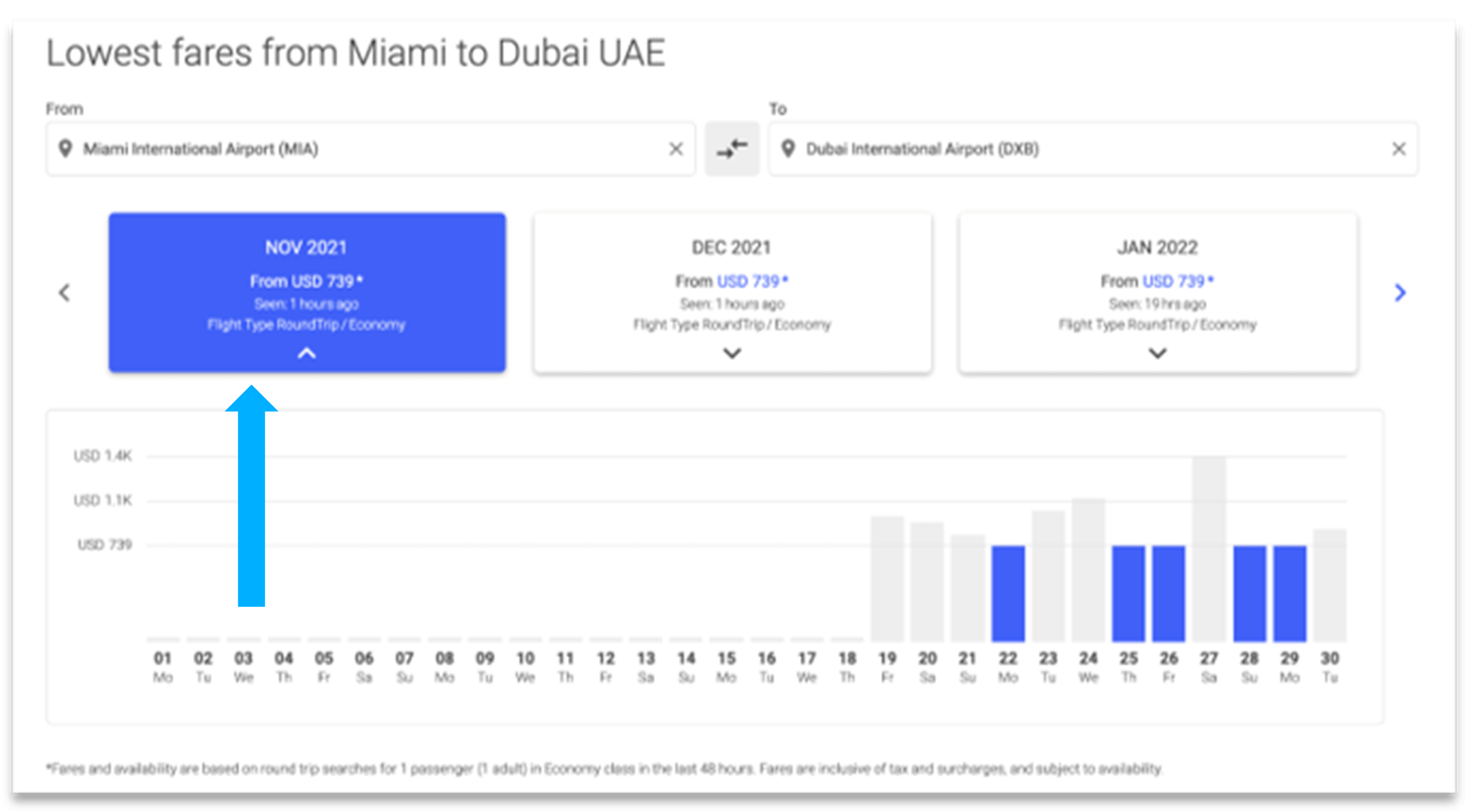
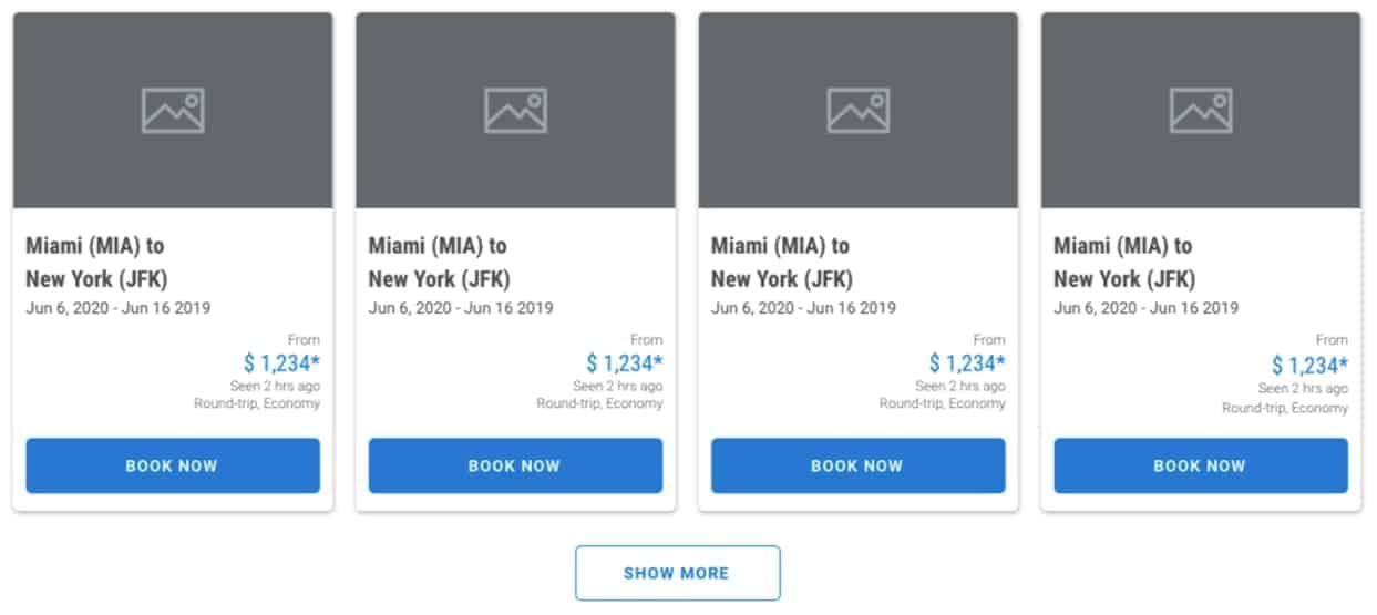
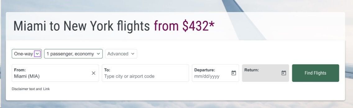
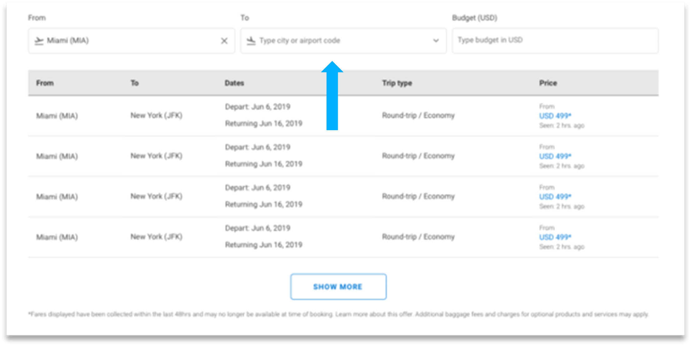
The table is used to display a list of options along with any features tied to each option, like dates, travel class, and price. The Table airModule is one of the most popular airModules.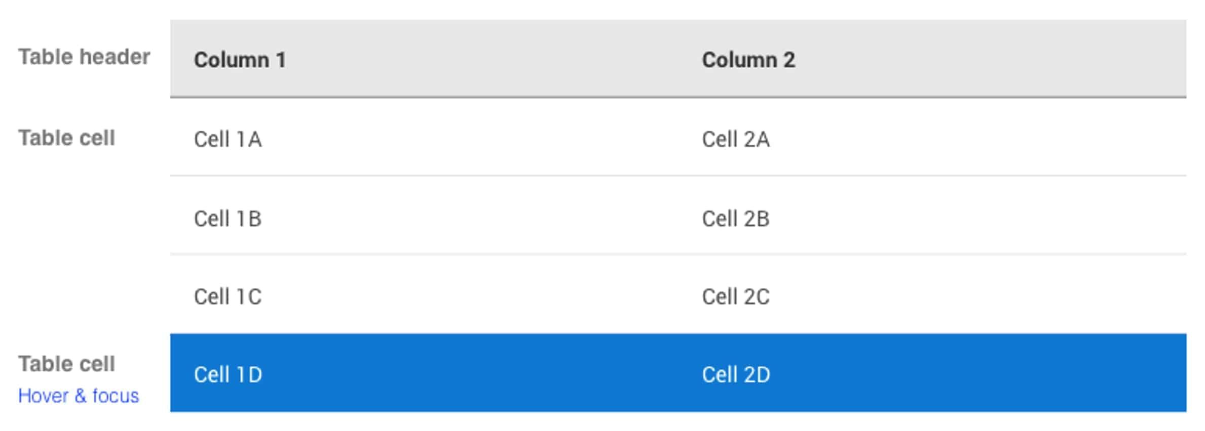
Example: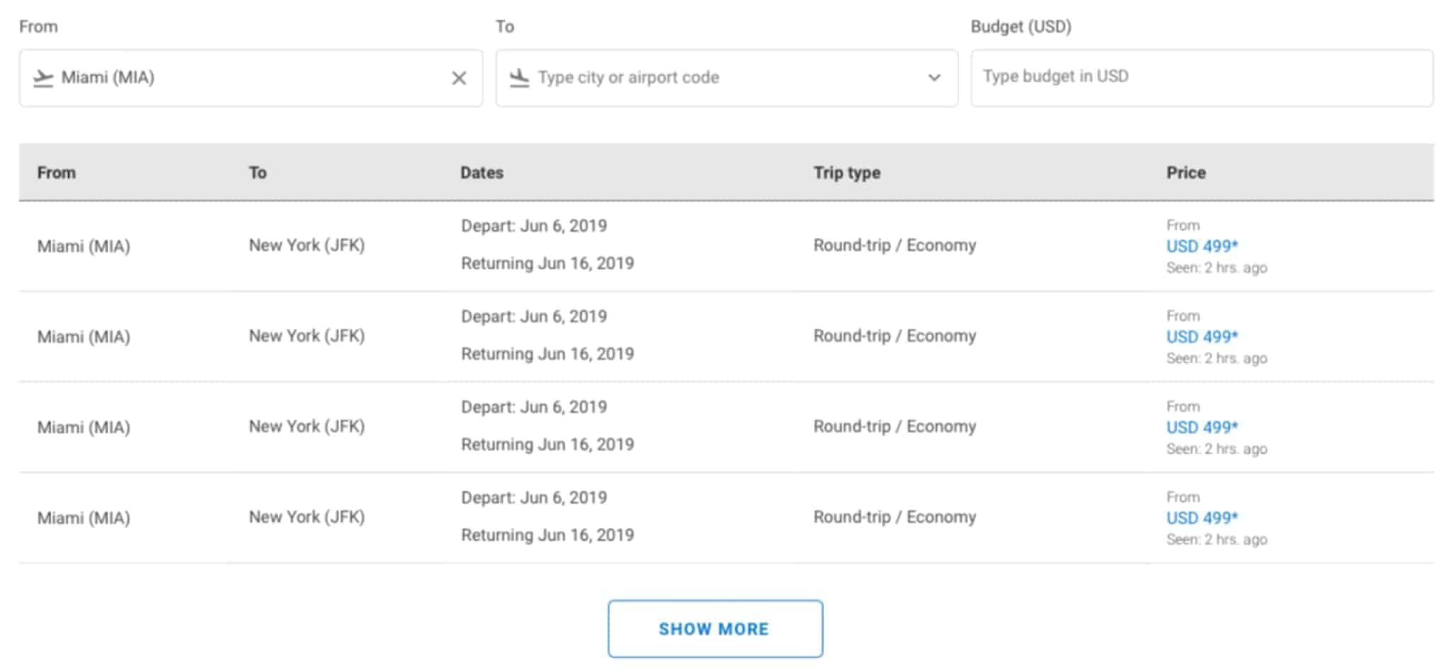
The accordion form is used to share large amounts of options in a compressed way. The Destinations Accordion enables airlines to share links to every destination in their route network, organized by country or region.
Example: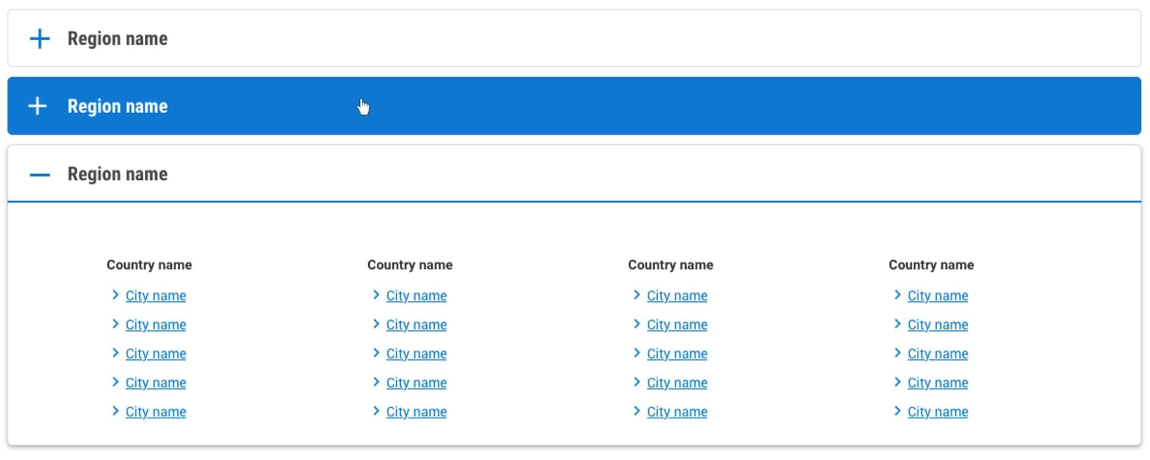
Used in Histogram airModules that display the lowest fares by day or by month.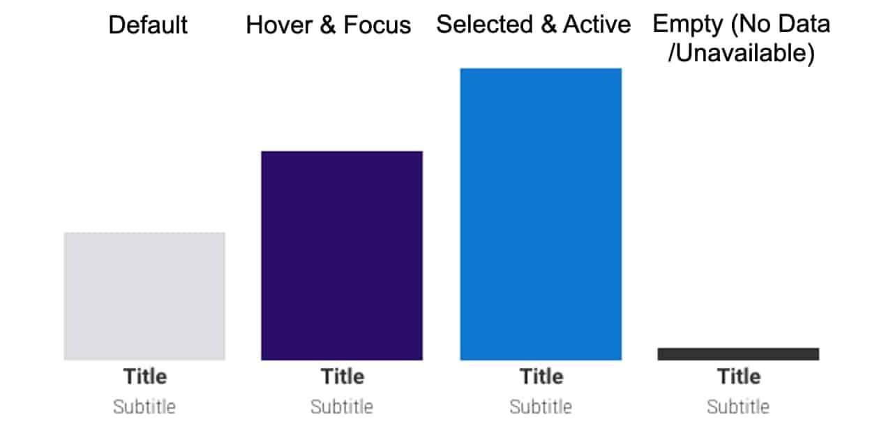
Example: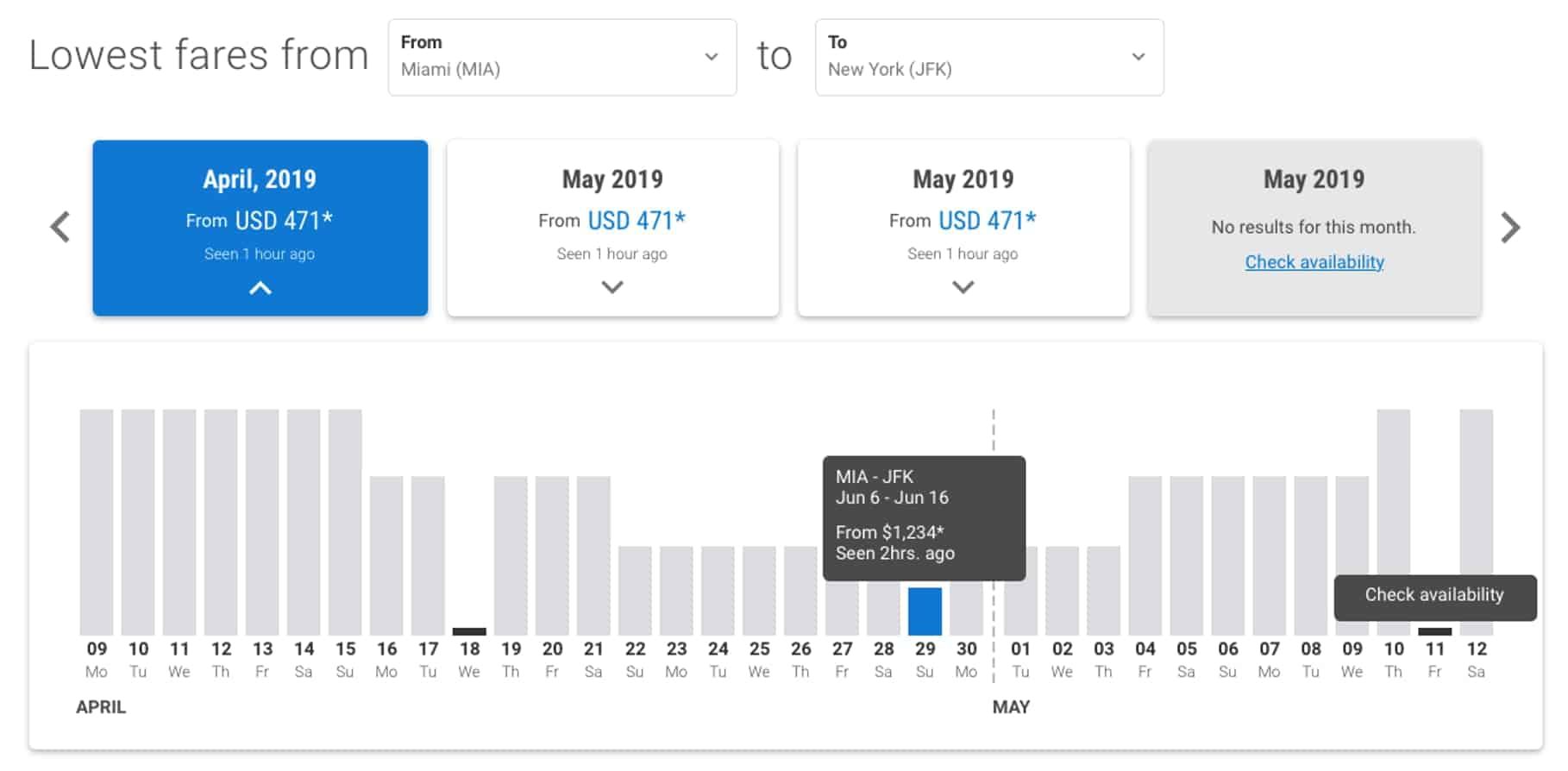
Used as the main title of the page.
Example: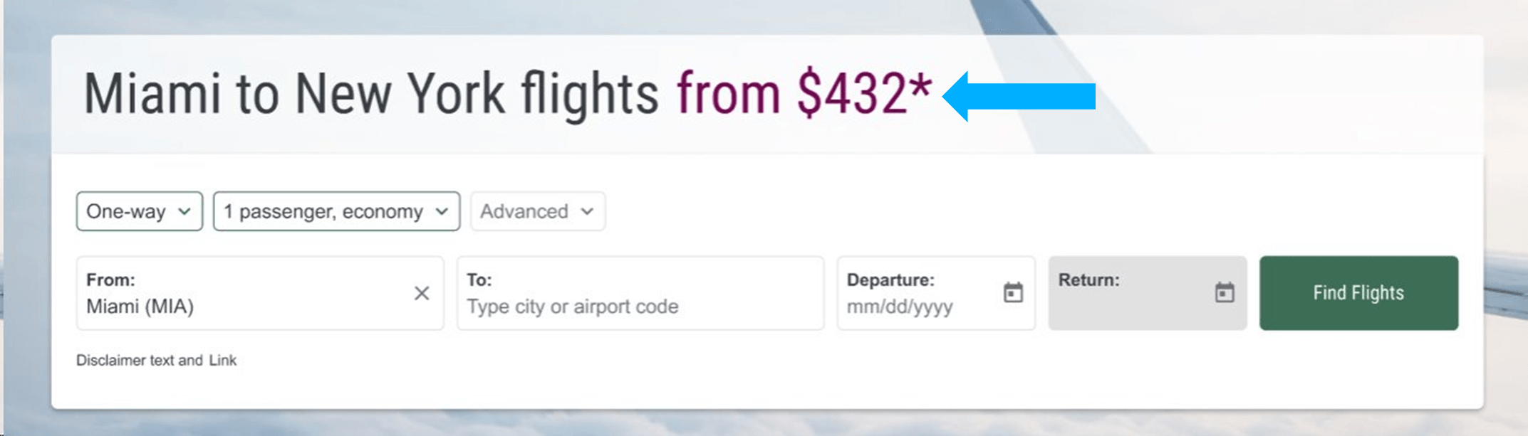
Used in our weather forecasting airModule.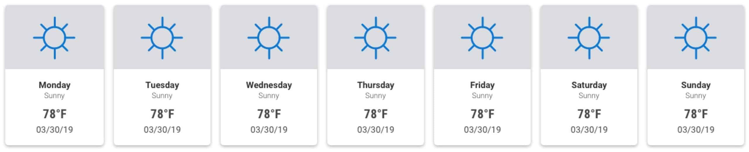
Used in airModules that display real-time fares and promotions to end-users.